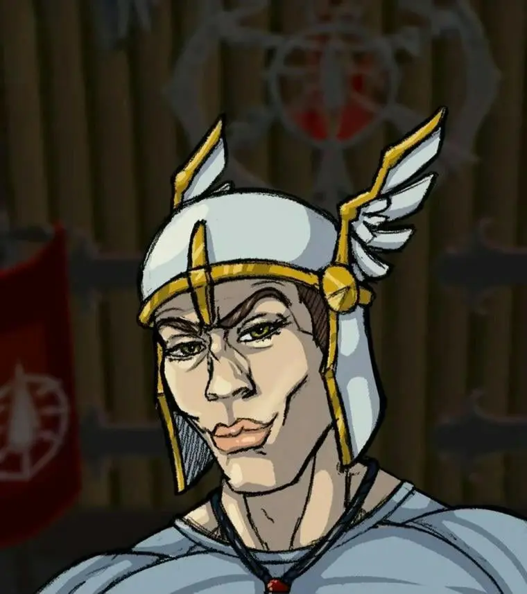
Today’s Penny Arcade is a near perfect commentary on the Unity debacle.
Whole comic linked above, but here’s the one-panel that is perfect.
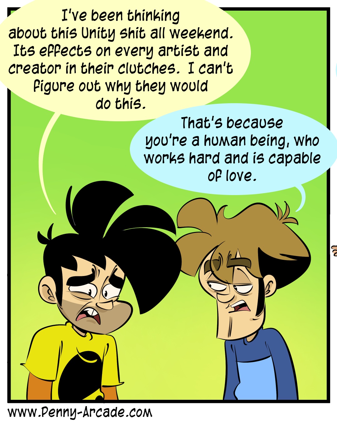
Wow. I haven’t seen a Penny Arcade comic in a long time. Their style has certainly, uh, evolved.
Yeah, into shit.
I came to say the same - used to read PA regularly back in the day. It looks… different now.
It’s honestly hard to look at and one of the reasons I stopped going years ago (one of the guys’ repeated transphobic social media posts was the other.)
Member CTRL+ALT+DEL?
member VGCATS??
How about “Questionable Content”….?
Poor Mr. VGCats. He went from running an engaging, vivid comedic romp to… selling x-rated pictures of his characters to greasy perverts.
All artistic paths end with furry porn.
I don’t see a problem here
Oh man I haven’t read QC in a long time, what happened?
No idea. Hopefully nothing bad. Wanted to share memberberries with fellow users 😄
It got boring cause the characters stopped evolving. They all act like the same person in different bodies.
It definitely has. Gabe links old comics on Twitter sometimes and it gives a really great comparison to how his style has changed.
I wonder what Fruit Fucker looks like these days
Oh yikes. I mean I agree that the first panel is solid but the other two reminded me why I stopped reading PA. So often the “punch line” is just edgelord violence or insults.
Reminds me of the Hbomberguy video that really dissects “gamer comics”.
The way this CEO operates is absolutely worthy of condemnation and viewing him through the lens of unfeeling cosmic horror is, if anything, a nicer take. But it’s fair to say that people operating at that level of wealth have become detached from and profoundly alien to normal folk.
I don’t think you’re parsing this comic fairly or engaging with its content by labeling it “edgelord violence or insults.”
Pretty much ALL of Hbomb’s substantive examples from the video are from CTRL-ALT-DEL which is like … the worst example imaginable. There’s screenshots of PA’s art, but beyond the one dumb gag about “stake me bro” he never really gets into PA’s writing. ODD, THAT. Because if you actually read Jerry Holkin’s posts, you’ll find a level of writing that puts the lie to the notion that these are idiots making cheap, derivative work. Setting aside the fact that they’ve been doing this so long that they basically defined the genre.
And as an aside, really Harris, web comic artists as targets? You’ve done it, you’ve achieved the epitome of punching down. These and other extremely sane takes from the guy that brought you an almost 2 hour long video on the goddamn Roblox “oof” sound effect.
Pretty much ALL of Hbomb’s substantive examples from the video are from CTRL-ALT-DEL which is like … the worst example imaginable.
Because it’s a video specifically about CAD (that’s why the video is literally titled “Ctrl + Alt + Del”) not webcomics in general. There are some references to other gaming comics and what they generally don’t do well but it’s preamble for why CAD is the worst. The whole point of this video is to be about Ctrl + Alt + Del and the guy behind it.
And as an aside, really Harris, web comic artists as targets?
No, it’s specifically about the CAD guy. He doesn’t talk about the other webcomic artists.
These and other extremely sane takes from the guy that brought you an almost 2 hour long video on the goddamn Roblox “oof” sound effect.
I’m curious what other “takes” you think he has if you didn’t even realize why the video called CAD primarily talks about CAD.
These and other extremely sane takes from the guy that brought you an almost 2 hour long video on the goddamn Roblox “oof” sound effect.
Or a 3 and a half hour video about how a game is just okay. If you don’t know how to edit down videos to a reasonable length, then you’re just wasting my time.
That’s disingenuous as hell. It’s about the motifs of the genre and what the game was aiming to accomplish after it’s predecessor.
And the Roblox video was only 28ish minutes. The rest of it is on Tommy “my mother’s very proud” Tallarico.
And both deserve the full 3 hours.
It’s pretty clear these guys put more time into complaining about the videos than they did actually watching them.
It’s about the motifs of the genre and what the game was aiming to accomplish after it’s predecessor.
Then perhaps he should have used a title and thumbnail that explained what the content of the video actually was going to be.
Also, this is not such a complicated topic that it takes three hours to explain. About the only long video that could justify its length is Folding Ideas’ video about NFTs, and only because it’s a very complex, very important, and, at the time, very relevant subject. Even then, some people just aren’t going to watch a two-hour video on the subject even if it is important. That’s the risk you take when you make a two-hour video.
And the Roblox video was only 28ish minutes. The rest of it is on Tommy “my mother’s very proud” Tallarico.
And both deserve the full 3 hours.
It obviously doesn’t, because then you wouldn’t be trying to justify the runtime by saying it’s only 28 minutes of real content. If the real content is only 28 minutes, then the video should also only be 28 minutes. He can rant about Tommy on a different video, and I can choose or not choose to watch it. See, that’s how YouTube works.
then you wouldn’t be trying to justify the runtime
That’s putting words in my mouth. The Roblox video is only about 28 minutes. The rest of the video the author makes very clear is about the unveiling of a pathological liar in the game industry.
It sounds like your issue is he should have picked a different title. Sure, that may have helped.
That was a very interesting video though. Nobody’s making you watch it, you’re wasting your own time!
So from the game developer side, hbomber’s video nails exactly why those comics exist. He gets into why the culture is draw to them and how it’s a reflection of them. I was shown this from another dev and I’ve shown it to others. Everyone has come to the same opinion. Yeah, hbomber is absolutely right about gaming culture and gamers. It’s really reflective in why the term hardcore gamer exists and why you jump so hard to defend the culture your are apart of.
Also hbomber isn’t punching down, he’s creating an informative video to help the culture around gaming grow. His channel is literally him doing that to several cultures. Including YouTubers.
You should give him a chance. Entirely watch the video and a few others. I’d give recommendations for some but I’m on Mobile in my way to bed. If you really want some though I can gladly give you some in the morning. Try to see them more as video essays rather than purely entertainment because that really doesn’t give it a fair shake.
They’ve done the cosmic horror joke many times. I found it funny in my 20s.
Gabe’s art has gradually deformed and is just horrible now.
The art is approaching cosmic horror on its own, or at least existential dread.
To be fair, that’s not all the strips. That’s the one the OP chose to show.
Like I’d say going through 20-30 strips only 2-3 were like that.
edit: here’s a strip that I thought was pretty decent but isn’t like the one in the OP
https://www.penny-arcade.com/comic/2023/06/09/convenienteWell that one made me snicker lol. Maybe I am being too harsh. Idk, I used to read PA daily when I was in high school but at this point a few decades later, it’s just something that I’ve grown out of so it seems pretty juvenile in retrospect.
This might be more of a “me” thing instead of “penny arcade” thing. 🤷
I found Jerry’s writing to be exactly as it was. I no longer have a taste for it.
They’re the “political cartoon” of gamers.
deleted by creator
Has Penny Arcade always been this hideous?
Right? I feel like it hasn’t. My first thought on seeing the link was ‘holy shit penny arcade still exists’ followed swiftly by ‘oh dear God what is this hideous malformation of my nostalgia’ shortly after the art loaded.
It almost looks like the art style is doing a reverse Garfield. It’s bizarre and hard to look at.
I’m so glad I’m not the only one that thinks this! I can see how and why it happened, as the art style became increasingly stylised and exaggerated over the years, but visually it’s really, really not my cup of tea. It feels like what happens when you spend all your time just drawing the same thing over and over (ie, two specific characters) to the point that they become increasingly caricaturised and distorted.
No one else I know dislikes the art, and like… I dunno, it’s a successful and well-loved comic that a lot of people enjoy. I don’t begrudge them that success. It’s just not a visual style that works for me. And it’s kind of nice to know others have noticed the same thing and it’s not just that my perception was completely off.
It feels Ren and Stimpy-tier, no offense meant but just the style of being overly garish without it being quite as warranted
Now you mention it, yeah, it does give me some Ren and Stimpy vibes.
Yeah, it’s better to do dinosaur comic and just don’t change the art at all.
No. There was a time around when I was in high school where it had some really great art, and writing. To see what it is in 2023… is grotesque.
Shit… I wonder how the forums are faring? I used to be all over those back in the day.
Reminds me of Larry Ellison:
Do not fall into the trap of anthropomorphizing Larry Ellison. You need to think of Larry Ellison the way you think of a lawnmower. You don’t anthropomorphize your lawnmower, the lawnmower just mows the lawn. You stick your hand in there it’ll chop it off, the end. You don’t think “Oh, the lawnmower hates me!” The lawnmower doesn’t give a shit about you. The lawnmower can’t hate you.
I thi k that’s the wrong timestamp. I had to skip ahead to about 38 minutes I think.
The build up is important, because Oracle is so terrible you need as much context as possible
Gosh, I kind of really hate their new art style.
So, it’s probably worth clarifying some things. When we say that we don’t understand why Unity is doing the things they’re doing, it’s not that we don’t literally understand. We aren’t confused about the reason: it’s money and control. That’s not the confusing part. Here’s where the confusion actually roosts: in seeking those things, they’ve undertaken a course of action that stands to lose them quite a lot of both, and the outcome is completely obvious. This is the kind of genius maneuvre you and I simply can’t comprehend.
It is quite rare to see modern Penny Arcade not suck, normally it’s about the creator’s midlife crisis and how he hates Millennials for being younger than him
Which is stupid AF cause aren’t Millenials the primary audience for PA comics? Why would you insult your base?
That was basically my reaction, but this is what happens when you have money, and audience, and a midlife crisis. That’s where there’s a period of the comics where all that happens is the characters talk about all the expensive shit they’ve bought lately and shit on millennials, but not in a self-aware way…
Can you post an example? I’ve followed it for a while and I’m honestly having a hard time thinking of a single comic like that.
I really don’t want to go through the webcomics, but I do know that 2016 was an especially bad time for this
Fair I guess. I honestly just have a hard time imagining Tycho ever doing that, he’s the opposite of someone who takes their success for granted.
Normally Tycho is the one going “Millenials bad” with Gabriel going “Money good”
CEO as cosmic horror is a concept with legs. This’ll spice up my next cyberpunk campaign.
I’m a proponent of the idea that company charters and financial reports are world-warping rituals that turn the company itself into a self-aware, self-serving horror
That’s an SCP, isn’t it? A sentient corporation?
I think that would make more sense in a Shadowrun campaign.
I love that setting, but those mechanics. Ooof. Way too heavy. I actually meant the genre not the system. In reality I’ve been running The Sprawl but I’m looking for a narrative forward cyberpunk game that can accommodate urban fantasy.
There’s a Forged in the Dark game called Runners in the Shadows which looks pretty cool!
Lol, one of the two options listed is what I’m using. Need to find something with support for fantasy stuff and if possible, alternative hacking rules. Hamish who wrote it mentioned he wasn’t super happy with how it turned out.
I still need to try Forged in the Dark, but Powered by the Apocalypse just makes me run back to Shadowrun as it is. It’s way too far the other way, barebones and genre-centric to a limiting extent. For all its issues, maybe even because of its bloat, it never leaves you out of options for any assortment of scenario themes.
I would actually highly recommend the [World, Star, Citie]s Without Number systems. They’ve been going for about ten years, and while the individual systems themselves are genre-centric (fantasy, sci-fi, and cyberpunk respectively), they’re all inter-compatible and offer a good midpoint between crunchy systems and rules-light.
Also, I think Savage Worlds is setting agnostic and a little bit crunchier than most rules-light systems, but I have little experience with it.
I did have good experiences with Savage Worlds. It’s system is a little strange, but it manages to be simple while still offering a good variety of mechanics for different themes, though it isn’t itself narratively-oriented if that’s what the group wants.
I use ICE’s Cyberspace and throw out everything that slows down the story. Works well enough. It was written before most of the world was online, so still has a lot of the quaint charm of early cyberpunk.
Supernatural did it in their season 7 arc.
Charmed did the reverse in that Hell is basically a bureaucracy.
Angel kinda did it in most seasons, but with a more “demonic law firm” angle.
I don’t remember much of angel but in supernatural it’s eldritch creatures posing as billionaires to control and dumb down humanity to use them as a perpetual food source. Actually pretty deep and prescient for an older show.
Nah, comparing them to cosmic horrors is giving them too much importance, I think.
I’d rather compare them to, say, the diarrhea that forced that plane to turn around a while back.
No cosmic anything, just a foul horrid unending flow of liquid excrement purposelessly ruining everyone’s day, making everything shittier, and stinking the whole place up for decades to come.
PA art style peaked about 2003. Holy shit, they’ve been at this a while.
Really? I would say it was about 2015.
It’s just a wet mouth on a long arm that reaches down to hell
I haven’t read penny arcade in years, but it brings me joy to see that the writing, at least, seems to be right where I left it. Now if you’ll excuse me, I’ve a deep crow that needs feeding.
Let’s not forget the CEO of unity was also EA’s CEO during their peak scummy years. Like when they were doing what they could to discourage the used game market.
*edit: damned autocorrect messing up my typing
Add a ! just before the [ of the link to the image to make it into an embed looking like this ->

Thanks!
Then where did Elon Musk come from?
The thing I keep thinking of is that Musk bought Twitter and destroyed billions of dollars of value with bad decision after bad decision, and this Unity thing is still dumber than all of that.
We need Olympics for managers to see who can be the most out of touch
Instead of Olympic swimming we get Olympic Drowning
I’d believe he’s also an anglerfish-style lure from a Hell dimension. I think I’d be more surprised if that wasn’t the case.


